Brand Identity & Responsive Website
Giving a new nonprofit an identity people recognize and a place where they can act on it.
Role
Brand Design
UI/UX Design
Web Design
Web Development
Company
Victory In Volumes
Stakeholders
Founders
Website
Overview
Victory In Volumes is a nonprofit bringing communities together in support of women's health and well-being. The founders had a mission and events they wanted to run, and they were already putting in the work: planning fundraisers, lining up partners. I built the identity and the website that let people find them, trust them, and join in, then handed both off so they operate without me.
Problem
The organization was new, and its infrastructure hadn't caught up to its ambitions. There was no visual identity yet, and the existing website wasn't built to take event signups, donations, or subscriptions. Someone who heard about the mission and wanted to help had no place to act on it, so the founders coordinated everything personally, one message at a time. Their reach ended where their personal follow-up did.
Solution
An identity that makes the organization feel warm and real, and one place where a visitor can do the three things that matter: show up, give, and stay in the loop. Behind the scenes, everything runs on tools the founders already know, at no monthly cost.
The mark
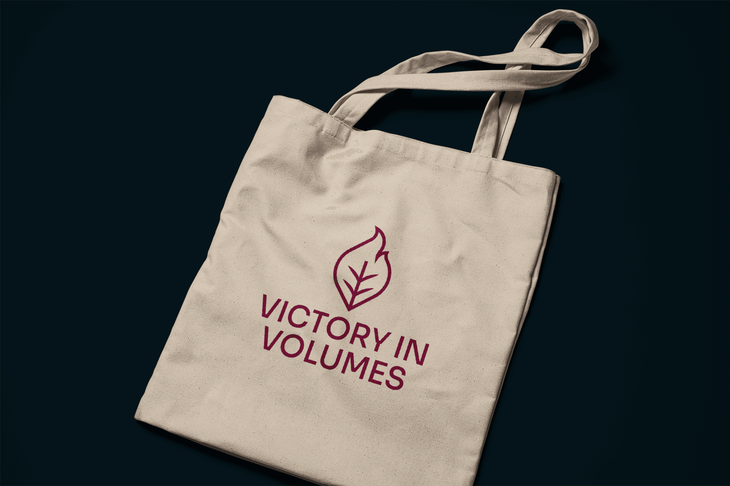
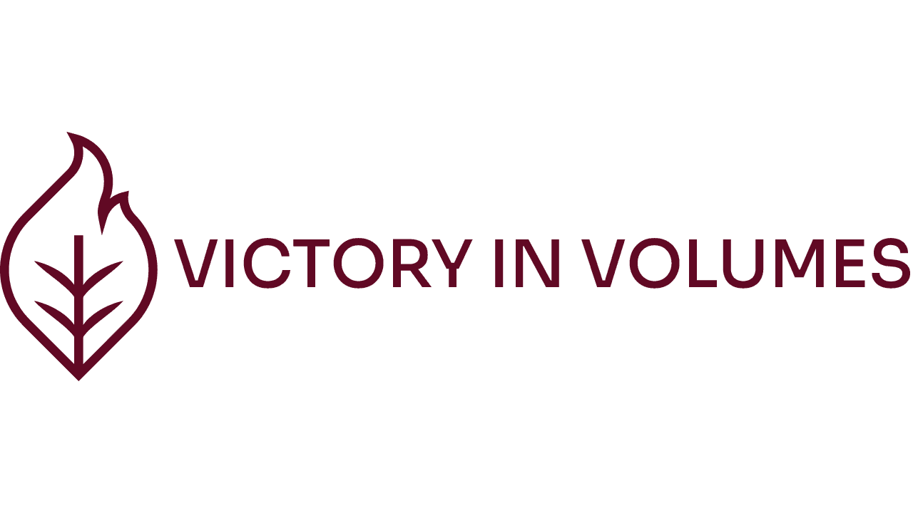
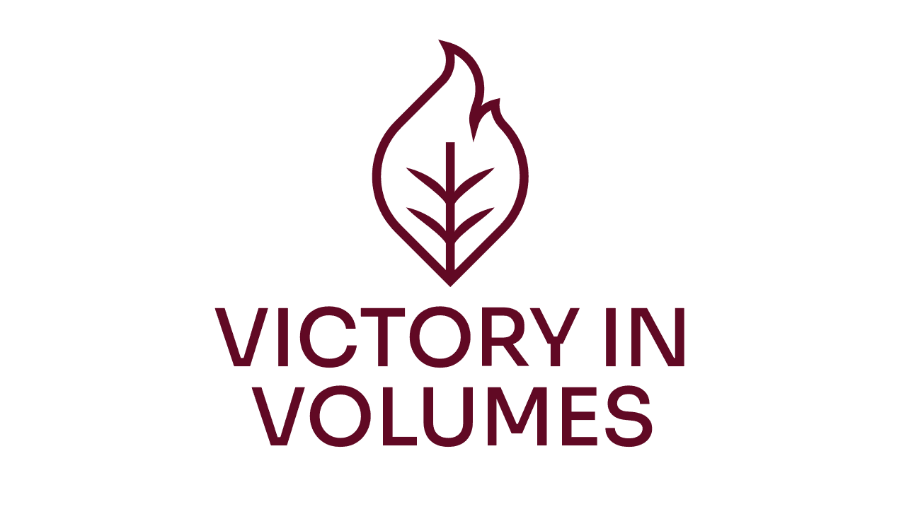
The outer silhouette blends a leaf and a flame: healing and growth with energy behind them. Inside, a stem branches outward like veins, collective voices spreading through a community. Warm gold on deep maroon keeps it strong without turning clinical.
We went through several rounds with the founders; the direction that survived was the one that still works small, in one color, on an embroidered tote or a social avatar, because that is where a nonprofit's logo actually lives.
Palette
Maroon carries strength, gold carries hope, cream and teal do the quiet work. Five colors because a real organization needs a flyer, a website, and a t-shirt to all feel like the same place.

The site
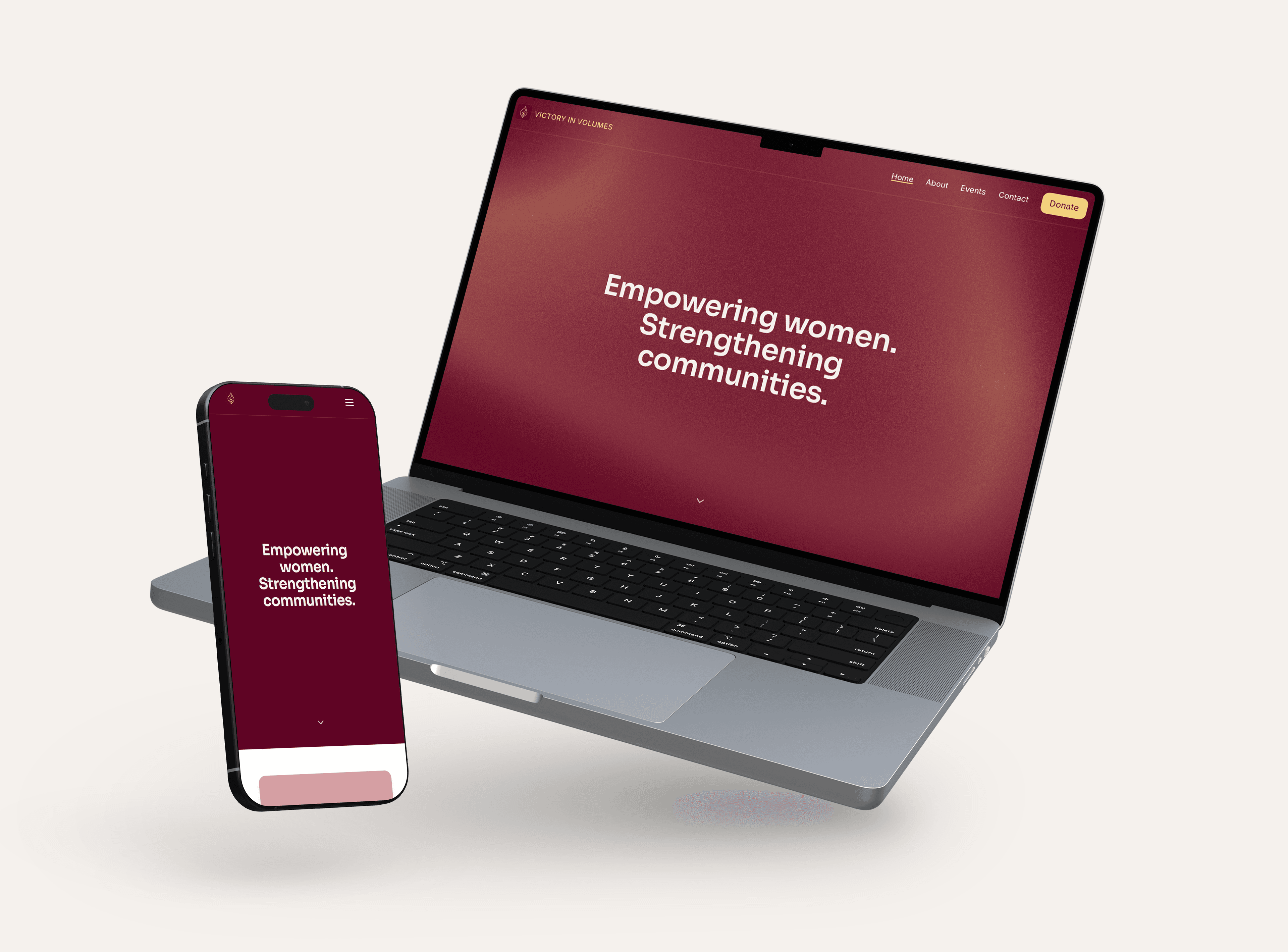
A visitor lands, gets the mission in a sentence, and sees proof the organization is real: actual events with photos, and named partners showing exactly where money goes.
Signing up for an event is picking a time and entering a name. Full time slots close themselves, so a class can never oversell. The care-package drive lists what is still needed, item by item, and checks things off as people pledge them, so a giver knows their box of diapers actually counts. Donations run through a platform that takes no cut, and the site says who receives them: Endofound for the pilates fundraiser, Younity NJ and Women Rising for the care packages. The newsletter is one field, straight into the org's Substack.
Every signup and pledge lands in a spreadsheet the founders already use, and confirmations go out on their own. Nothing to learn, nothing to maintain, nothing to pay for. That constraint was the real design brief: a two-person nonprofit can't afford software, staff, or me forever.
Outcome
The site shipped and is live, and its second event is running through it now. The founders operate everything themselves; my involvement ended and nothing broke. I didn't set up analytics before handoff, so I can't claim traffic or conversion numbers, and I won't. What changed is structural: the organization now has an identity people recognize and a home where showing up, giving, and staying involved each take a minute.